Why Your AI Websites Look Like AI Websites
Type “build me a modern landing page” into Claude and you get the average of every website on the internet. Purple gradient. Three cards in a row. A footer nobody looked at twice. You've seen that site a thousand times, and so have your customers.
Here's what most people miss. Claude can see. Drop in a screenshot and it reads the layout, the spacing, the type sizes, all of it. Professional designers don't start from a blank page either. They collect references and work from them. You're about to do the same thing, except Claude does the building.
Credit where it's due: this list comes from a post by Viktor Oddy (@viktoroddy) on X. He shared the 8 links. I went through every one, checked what's really free, and wrote the workflow and prompts so a total beginner can use them today.
Find It. Screenshot It. Drop It In.
Seven of these eight sites work the exact same way:
- Find a design you like on the gallery.
- Screenshot just that part. Mac: Cmd + Shift + 4, then drag a box. Windows: Windows key + Shift + S.
- Drop the image into Claude. In the Claude app, drag it into the chat. In Claude Code, drag the image file into the terminal, or copy the screenshot and paste it with Ctrl + V.
- Paste the prompt from this guide with your details filled in.
The one exception is motionsites.ai, where you skip the screenshot because they hand you the prompt.
One rule: copy the pattern, not the brand. Layout, spacing and structure are fair game. Every designer alive works from references. Their logo, their words and their photos are theirs. Every prompt below tells Claude this, so leave that line in.
This works in the Claude app, in Claude Code, and in any other AI builder that takes images (Cursor, Lovable, Bolt, Codex). I use Claude Code because it builds the real files on your computer.
Do this once before you start
Paste this first. It keeps every section on the same colors and fonts, so your page doesn't end up looking like eight different websites stitched together.
motionsites.ai
Copy-and-paste prompts for animated and 3D websites
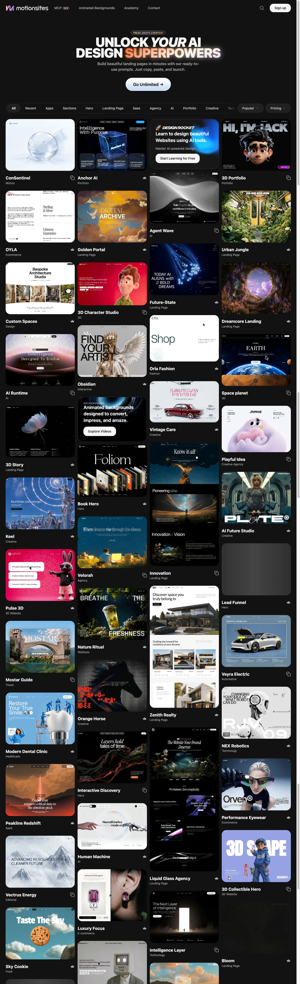
Real screenshot of motionsites.ai. Click for the full-length capture.
What it is: A library of finished website designs where every design comes with the full prompt that built it. Animated heroes, 3D scenes, full landing pages, single sections. You don't screenshot anything here. You copy the prompt and paste it into Claude.
When to use it: Use it first. This is where your hero section (the top of your page, the first thing people see) comes from. It's the fastest way to get a site that moves and looks custom.
How to use it with Claude
- Go to motionsites.ai. Click Pricing (top right of the grid) and choose Free.
- Pick a category that matches what you need: Hero, Landing Page, Sections, SaaS, Agency, Portfolio.
- Click a design you like. Hit the copy button to grab the full prompt.
- Paste the prompt below into Claude, then paste the motionsites prompt at the bottom where it says to.
Tip: The prompts are written for any AI builder (Lovable, Bolt, Cursor, Claude). They work in Claude Code as is.
navbar.gallery
Navbar inspiration gallery
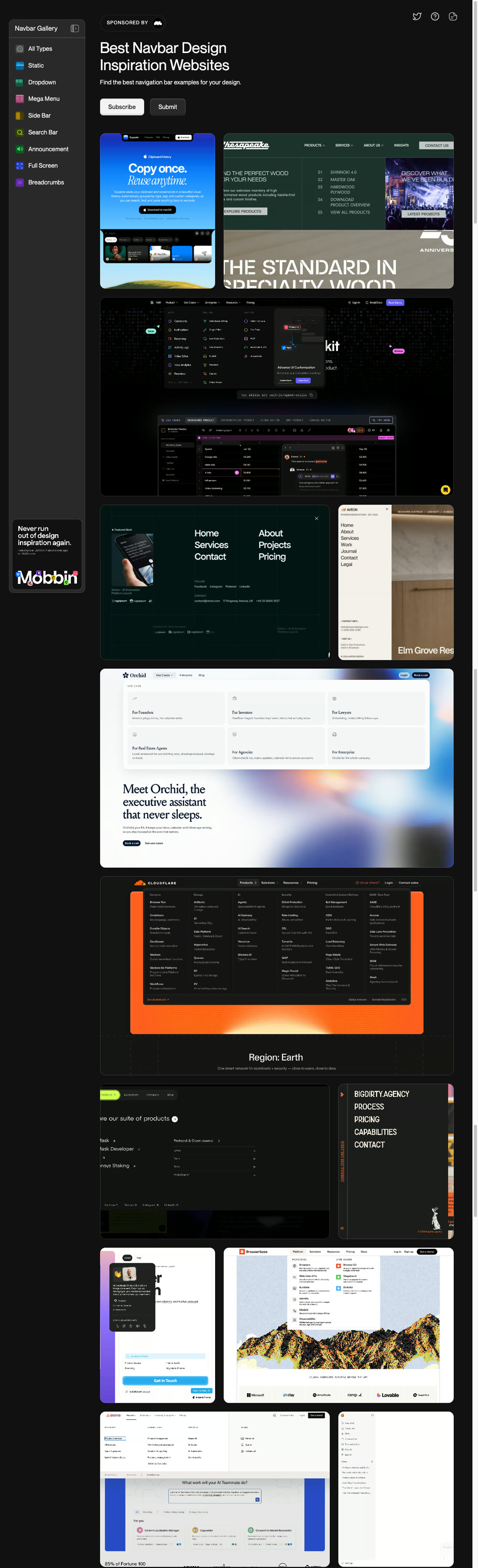
Real screenshot of navbar.gallery. Click for the full-length capture.
What it is: A gallery of nothing but navbars. The navbar is the menu strip at the top of a site with your logo, your links and your main button. Built by Christina Liubynska. You can browse by type: sticky, dropdown, mega menu, sidebar, announcement bar, full screen and more.
When to use it: Right after your hero is done. The navbar sits on top of everything, so a cheap one makes the whole page look cheap.
How to use it with Claude
- Pick a type. If you have 4 or 5 links, look at Static / Sticky. If you have a lot of pages, look at Dropdown or Mega Menu.
- Find one you like and screenshot just the navbar.
- Drop the screenshot into Claude with the prompt below.
footer.design
Footer design gallery
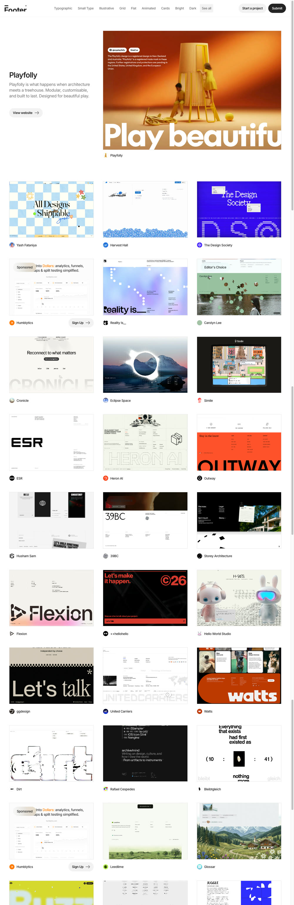
Real screenshot of footer.design. Click for the full-length capture.
What it is: A curated gallery of website footers, made by the studio NOOON. The footer is the block at the very bottom of the page: links, contact info, socials, legal stuff. You can sort by style, like Typographic, Large Type, Grid, Cards, Animated, Dark, Bright and Bold.
When to use it: At the end of the build. Most AI-built sites end with a sad grey strip and a copyright line. A strong footer is one of the cheapest ways to look like you paid a designer.
How to use it with Claude
- Filter by a style that matches your page. Big bold hero? Try Large Type. Clean and minimal? Try Small Type or Grid.
- Screenshot the whole footer.
- Drop it into Claude with the prompt below.
cta.gallery
Call-to-action inspiration
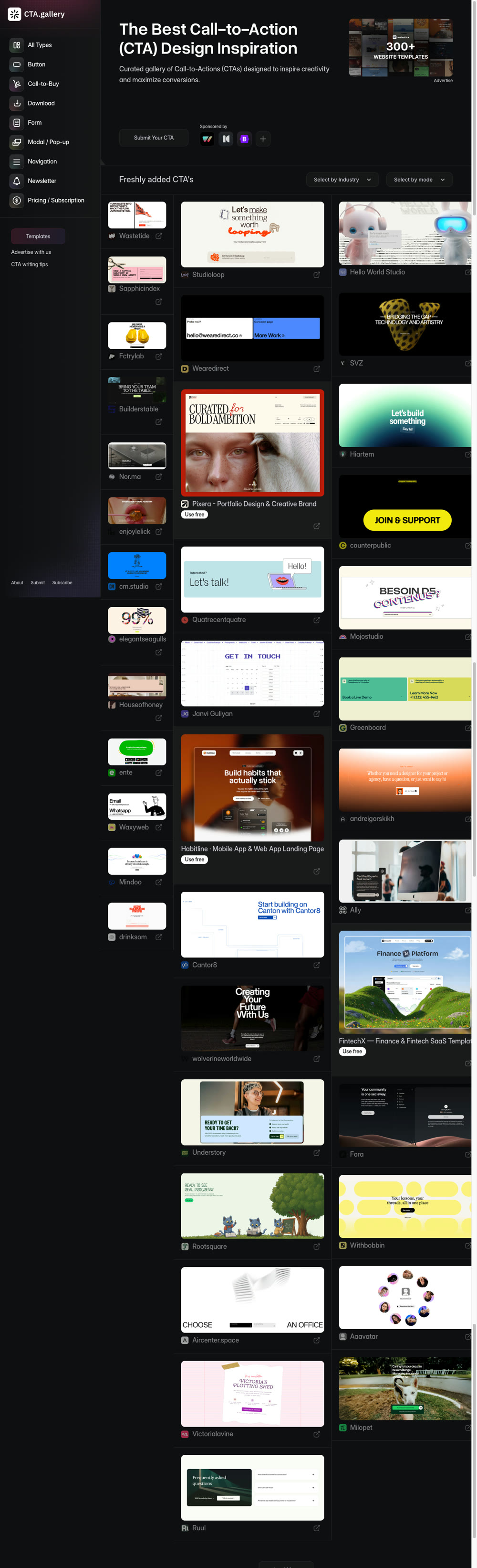
Real screenshot of cta.gallery. Click for the full-length capture.
What it is: A gallery of calls to action. A CTA is the part of the page that asks for the sale, the signup or the booking. This site collects the good ones and lets you filter by type (Button, Form, Newsletter, Modal / Pop-up, Pricing / Subscription, Download, Call-to-Buy), by industry, and by light or dark mode.
When to use it: Any time you need someone to do something. This is the section that makes you money, so don't let Claude wing it. Most pages need one CTA near the top and a big one near the bottom.
How to use it with Claude
- Filter by the type you need. Collecting emails? Newsletter or Form. Selling? Call-to-Buy or Pricing / Subscription.
- Screenshot the CTA block you like.
- Drop it into Claude with the prompt below.
404s.design
Creative 404 error pages
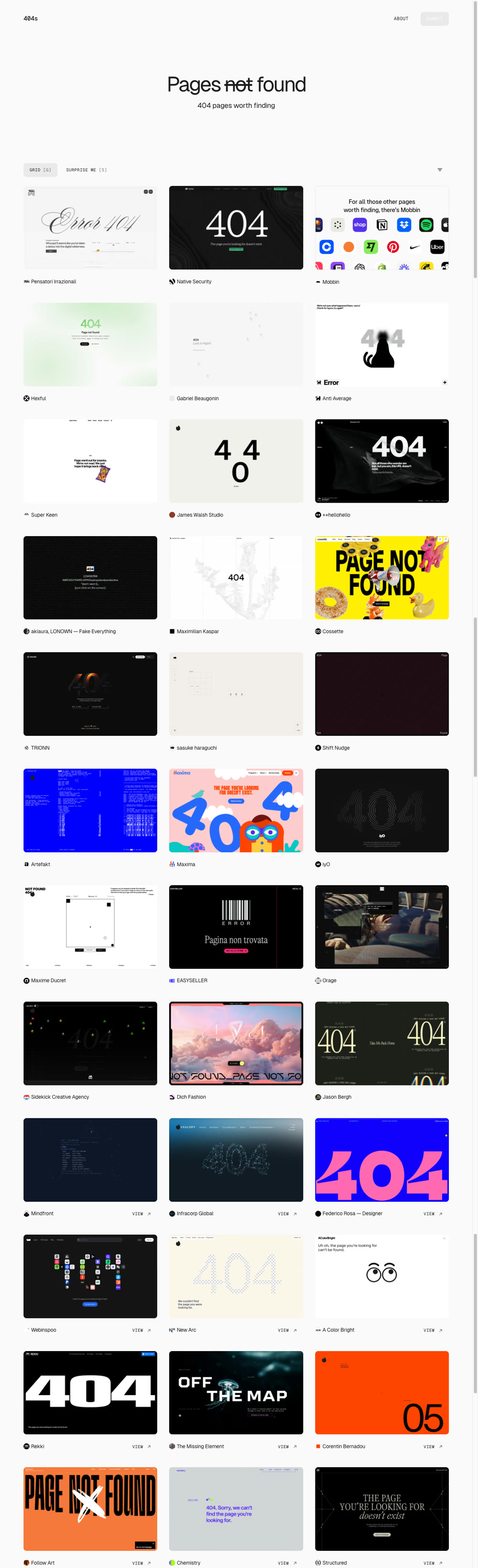
Real screenshot of 404s.design. Click for the full-length capture.
What it is: A curated gallery of 404 pages, built by Finnian Sturdy. A 404 page is what people see when they hit a link on your site that doesn't exist. The filters are great: by style (3D, Brutalist, Hand-drawn, Minimal, Playful, Retro), by interaction (Animated, Game, Hover Effects, Scroll-driven) and by industry.
When to use it: Last. It's the page nobody thinks about, which is exactly why it makes you look like a pro. It's also a low-risk place to have fun, because it can't break your sales page.
How to use it with Claude
- Filter by a style that fits your brand. Pick something with personality.
- Screenshot the page. If it's animated or a game, write one sentence describing what it does.
- Drop it into Claude with the prompt below.
unsection.com
Section-first design inspiration
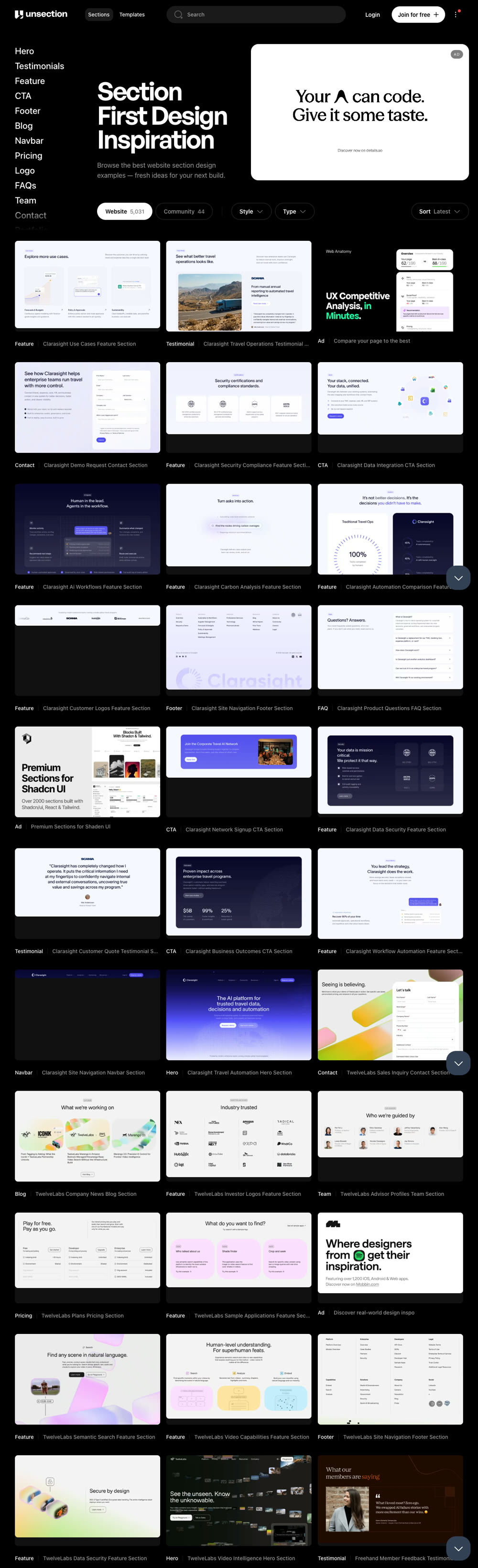
Real screenshot of unsection.com. Click for the full-length capture.
What it is: A big library of website sections pulled from real sites and sorted by what they are: Hero, Testimonials, Feature, CTA, Footer, Blog, Navbar, Pricing, Logo, FAQs, Team, Contact, Portfolio. You can also filter by style and type. Think of it as the catch-all for everything the other galleries don't cover.
When to use it: For the middle of your page. Testimonials, pricing tables, FAQs, logo strips, team sections. This is where AI-built pages usually fall apart into the same three boring cards.
How to use it with Claude
- Click the category you need in the left menu (say, Pricing or FAQs).
- Open a section you like and screenshot it.
- Drop it into Claude with the prompt below. Reuse the same prompt for every middle section.
Tip: That "do not invent" line matters. Left alone, AI will happily make up five-star reviews from people who don't exist. Don't let it.
bentogrids.com
Bento grid layout inspiration
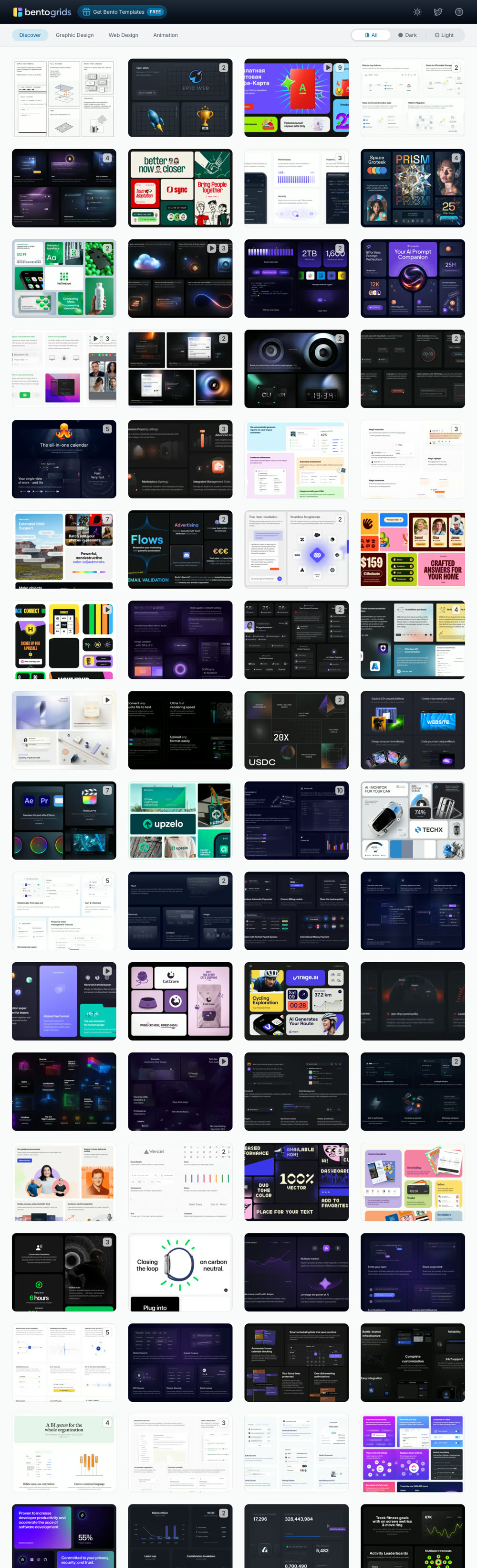
Real screenshot of bentogrids.com. Click for the full-length capture.
What it is: A gallery of bento grids. A bento grid is that layout you've seen on Apple's site: a block of different-sized rounded boxes that fit together like a Japanese lunch box, each box showing one feature. The gallery pulls examples from real companies and lets you filter by Web Design, Graphic Design or Animation, and by dark or light.
When to use it: For your features section. If Claude gives you three identical cards in a row (it will), replace them with a bento grid. It's the fastest single upgrade on this list.
How to use it with Claude
- Filter to Web Design, then pick dark or light to match your page.
- Find a grid with roughly the same number of boxes as you have features. Screenshot it.
- Drop it into Claude with the prompt below.
60fps.design
UI animation and micro-interaction inspiration
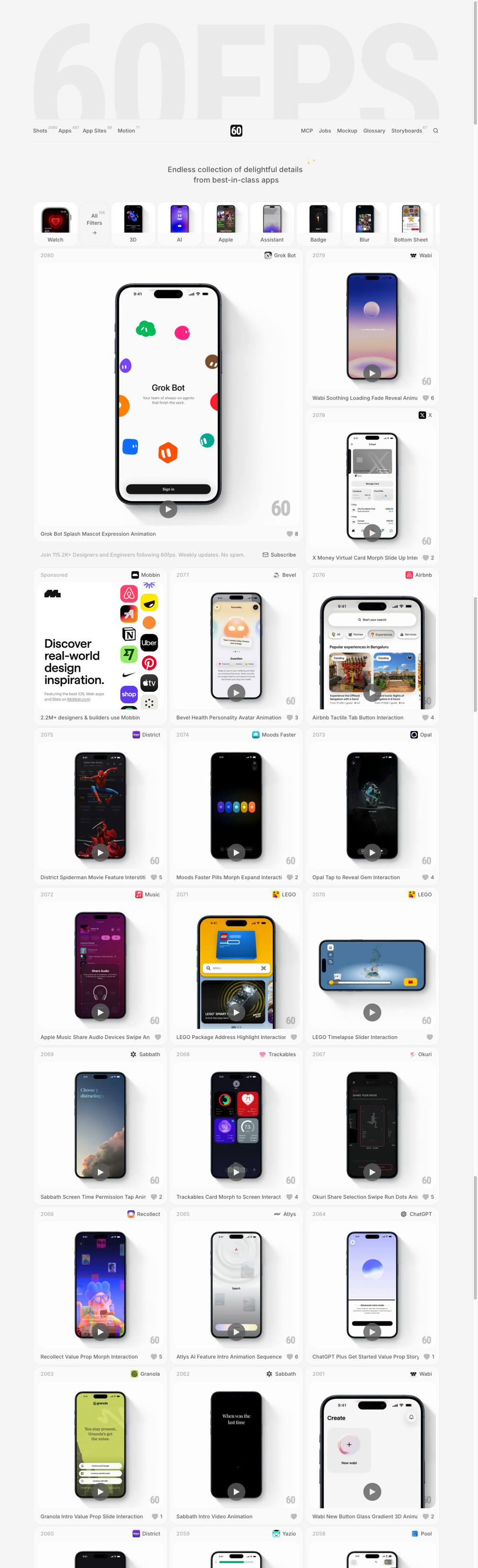
Real screenshot of 60fps.design. Click for the full-length capture.
What it is: A collection of 2,000+ short clips of the tiny animations inside the best apps in the world (Airbnb, X, ChatGPT and hundreds more). Buttons that squish. Cards that morph. Numbers that tick up. These details are called micro-interactions, and they're the difference between a site that feels alive and one that feels like a PDF.
When to use it: At the very end, as polish. Get the page built first, then add motion. Never the other way around.
How to use it with Claude
- Here's the catch: these are videos, and you can't drop a video into Claude. So you steal the words. Every clip has a descriptive title and tags like Morph, Stagger, Spring Physics, Shimmer, Parallax, Reveal. That's the real vocabulary designers use, and Claude knows all of it.
- Find a clip you like. Write down its title and tags. Screenshot the start and the end of the animation if you can.
- Give Claude the words and the screenshots with the prompt below.
Tip: No idea how to describe an animation? Ask Claude: "Explain what stagger, morph, spring physics and parallax mean in website animation, with one example each." Two minutes and you speak the language.
Build a Full Landing Page, Section by Section
Don't ask for the whole page in one prompt. That's how you get the average-of-the-internet site again. Build one section at a time, look at it, fix it, move on. Here's the order I'd go in:
- Give Claude your brand brief. Paste the brand brief prompt from the top of this guide. Fill in the brackets. This is what keeps eight separate sections looking like one site.
- Hero from motionsites.ai. Filter to Free, pick a hero, paste it in with the wrapper prompt. Now you have a page with a top that moves.
- Navbar from navbar.gallery. Screenshot, drop, prompt. Tell Claude to put it above the hero.
- Middle sections from unsection.com. One at a time. A logo strip or proof section, then testimonials, then pricing, then FAQ. Use your real content.
- Features from bentogrids.com. Swap the boring three-card row for a bento grid.
- The ask from cta.gallery. One big CTA near the bottom. Add a smaller one higher up if your page is long.
- Footer from footer.design. Close the page properly.
- 404 page from 404s.design. Ten minutes. Makes you look like you thought of everything.
- Polish with 60fps.design. Pick two or three micro-interactions, tops. The main button, the cards, maybe the headline. Then stop.
After each section, look at it in your browser. If something's off, screenshot your own page, drop it back into Claude and say what's wrong in plain words: “the spacing above the pricing section is too tight” or “this looks broken on my phone.” Claude sees the problem and fixes it. That loop is the whole skill.
When the page is done, run this once to tie it together:
4 Mistakes That Will Wreck This
- Asking for the whole page at once. One section per prompt. Every time.
- Mixing five different styles. A brutalist navbar on a soft pastel hero looks like a ransom note. Pick references that feel like they belong together, and let the brand brief hold the line.
- Animating everything. Two or three micro-interactions feel premium. Twenty feel like a casino. Motion goes last and goes light.
- Letting AI write fake proof. If Claude fills your testimonials section with made-up names and numbers, delete them. Real ones or none.
That's it. People pay designers thousands for a page like this because they think taste is something you're born with. Mostly it's knowing where to look and what to copy. Now you know where to look.
All Resources
Pricing and free limits were checked on September 18, 2026. These sites change their plans, so check their pages for current numbers. I have no affiliation with any of them.